Art Realm: A Slice of the Sea, Right in Your Grey City
Deep down, nearly every city dweller carries a dream of living by the sea.
Outside the window, grey skylines stretch on. The ears are filled with the constant hum of traffic. Day after day, we move through forests of concrete and steel, drifting further from that shade of blue. But fortunately, interior design has a gentle power – it can bring distant landscapes into our everyday spaces, right under our feet.
The tefloor modular carpet collection “Art Realm” does exactly that: it brings the ocean indoors.
A touch of blue that awakens the calm within
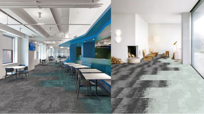
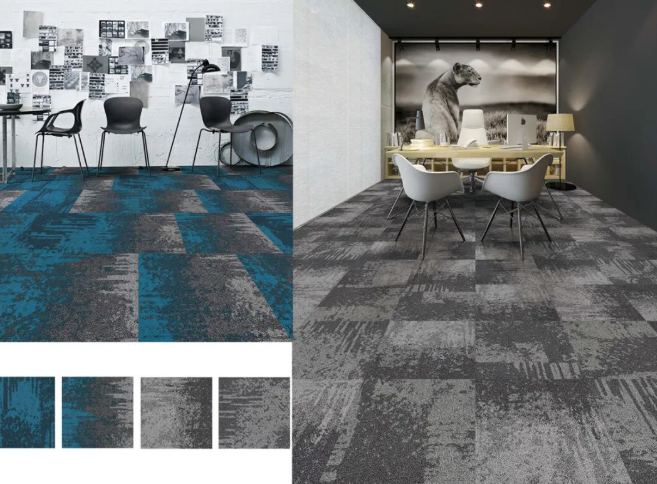
“Art Realm” is a collection built around seamless gradients. It is neither a flat solid colour nor a jarring contrast. Instead, it mirrors the shifting light on the ocean’s surface – from deep navy to pale aqua, from sapphire to grey‑blue, layer by layer, gently transitioning. That ocean‑like romance, paired with breathtaking colour combinations, is impossible to resist.
You simply cannot miss it.
Imagine walking into your office each morning – not to cold, hard tiles, but to a floor that unfolds like a stretch of sea. Arrange the tiles freely, and you can create any coastal mood you wish: rolling waves at high tide, or the vast stillness of a wind‑less bay. As you move through the space, your moments are bathed in a blue heart‑sea, and in the gaps between busy tasks, you find a pocket of serenity.
Greet every new day with a clear, pure colour – that, in itself, is a way of life.
Ocean textures that whisper stories underfoot
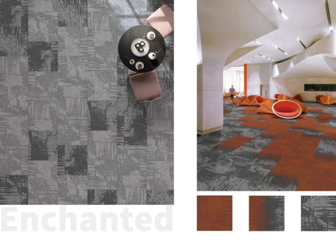
The design of “Art Realm” goes far beyond colour. Look closely, and you’ll notice irregular geometric patterns interwoven with dotted textures – like gentle waves lapping against a sandy shore, leaving behind layered, fleeting marks.
These textures are not mere decoration; they are a sincere tribute to nature. They transform the carpet from a flat plane of colour into a tactile, living element with warmth and narrative. Whether you walk on it barefoot or simply glance down, you can almost feel the breath of the ocean.
Blue: trust, inclusiveness, and returning to yourself
Blue is never just a colour.
It represents calm and depth. It is the profound ocean, teeming with life and mystery; it is also the boundless sky, embracing every flight and every gaze. Blue carries a powerful inclusiveness – it settles a restless mind and brings clarity to tangled thoughts.
This reminds us that only by smoothing our anxieties and staying immersed and steady can we truly return to ourselves.
As Leatrice Eiseman, Executive Director of the Pantone Color Institute, once said: “We are living in a time that requires trust and confidence. The dependable and stable classic blue hue presents a sense of permanence and reliability, resonating deeply and serving as a solid foundation we can rely on.”
Within the blue world of “Art Realm,” there is no rush, no chase. Just stand or sit quietly, let the blue envelop you, and feel that trust rise from the floor beneath.
A fusion of vintage and modern – poised yet vibrant
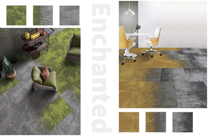
The “Art Realm” palette is composed of base colours, accent colours, and transitional shades that bridge them. It does not chase sheer brightness; instead, it subtly incorporates vintage tones –
- Slightly aged blue‑greens, grey‑blues, indigos…
- Adding a sense of composure without losing vitality;
- Through these nostalgic hues, it presents a style that is sunny, positive, and deeply retro.
This fusion allows “Art Realm” to fit seamlessly into modern minimalist offices while adding a layer of temporal depth and human warmth. It is understated yet captivating, quiet yet unforgettable.
Gradient layouts that unlock endless spatial possibilities
“Art Realm” is designed for gradient transitions – from vibrant colours to neutral tones. The greatest beauty of this approach lies in its flexibility: you can tailor the layout to your specific zoning needs.
- For open workstations, a gradient from deep blue to light blue can create a layered sense of privacy and openness;
- For lounge or meeting areas, a transition from blue to grey fosters a calm, relaxed atmosphere;
- For corridors or reception spaces, splashes of blue against neutral tiles can guide the eye and energise the flow.
Every arrangement becomes a new creation, and every space can claim its own unique “coastline.”
Art Realm: a blue dream in the heart of the city
We cannot move the sea into our office buildings. But we can bring its colours, its textures, and its spirit into our daily surroundings.
That is what “Art Realm” does – tile by tile, it carves out a blue heart‑sea in the grey city. As you walk through it, time slows, anxiety fades, and inspiration quietly emerges.
Let every day begin with a clear, refreshing shade of blue.
tefloor modular carpet – “Art Realm” – inspired by the ocean, spoken in blue, writing a long poem of serenity and romance for the urban workspace.