Meta Title: Asymmetric Carpet Tile Layouts | Creative Office Flooring Design
Meta Description: Discover how staggered carpet tile installation creates dynamic 3D spaces. Irregular geometries, blue serenity, and vintage color gradients for modern offices.
Introduction: When Order Meets Spontaneity
The most compelling commercial interiors today are not built on rigid grids—they are shaped by controlled randomness. By embracing staggered installation patterns, designers are moving away from the monotonous “checkerboard” approach and toward something far more evocative: a natural, eco-conscious, and undeniably fashionable foundation.
This is flooring as spatial sculpture. Through the deliberate misalignment of tiles, what was once a flat surface becomes a three-dimensional canvas—one that expresses personality, movement, and design intelligence.
1. The Geometry of Freedom
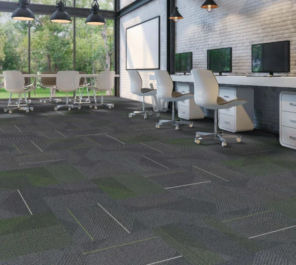
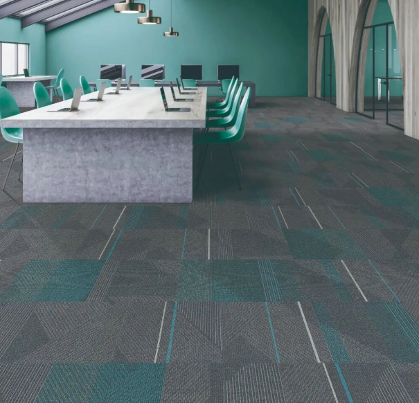
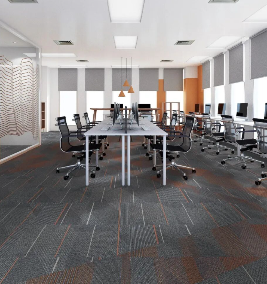
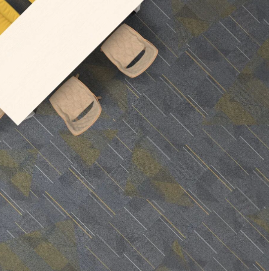
At the heart of this aesthetic is the interplay between irregular geometric forms and linear flow patterns. These two elements coexist on the same plane, creating a dialogue between structure and spontaneity.
- Irregular Geometrics: Organic polygons, offset diamonds, and fragmented shapes suggest natural formations—cracked earth after rain, ice floes on a lake, or crystalline mineral clusters.
- Linear Veins: Woven through these shapes are meandering lines that provide directional energy, guiding the eye across the floor and into the larger space.
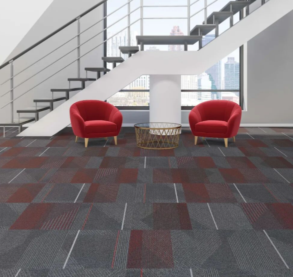
The magic happens in the arrangement. Randomized placement—where tiles are rotated, shifted, or deliberately misaligned—produces an entirely different mood each time. One layout might feel grounded and meditative; another might pulse with kinetic energy. The same product, reimagined through installation alone.
2. The Psychology of Blue: Depth, Calm, and Return
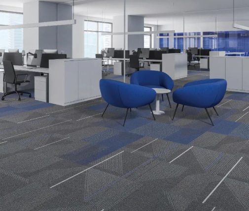
Within this collection, blue serves as the emotional anchor. But this is not the loud, primary blue of a child’s playroom. This is a profound, introspective blue—the color of deep ocean trenches and twilight skies.
Blue’s power lies in its boundless inclusivity:
- It absorbs anxiety rather than reflecting it back at us.
- It creates a container for thought, allowing the mind to settle into a state of quiet stability.
- In its depths, we find the space to return to ourselves.
After the turbulence of recent years, this quality is not just aesthetic—it is therapeutic. A blue-dominant floor becomes a stabilizing force in high-pressure work environments, silently encouraging occupants to breathe, focus, and reconnect with their inner compass.
3. The Minimalist Protagonist: Solid Tones as Hero
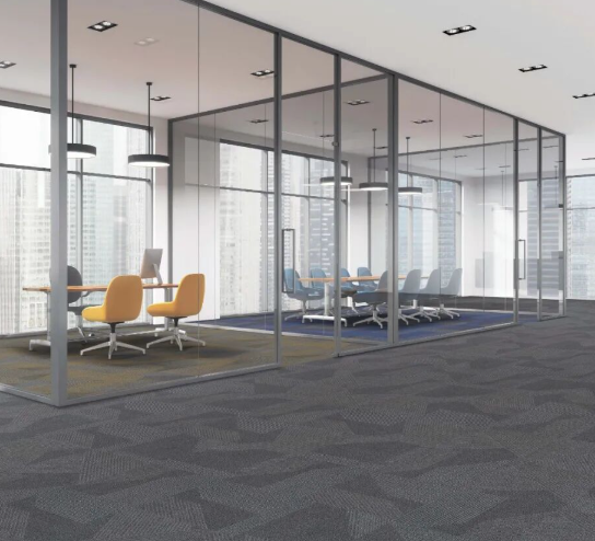
Paradoxically, the most visually arresting installations often feature solid, neutral tiles as the protagonist. Rather than competing with bold furniture or elaborate wall graphics, a refined field of warm grey, soft taupe, or the aforementioned deep blue allows the architecture of the space itself to shine.
But “solid” does not mean “empty.” Within these monochromatic fields, subtle textural accents—a fleck of contrasting yarn here, a slight tonal shift there—create a “painted” effect. The result is a vivid yet restrained composition, where the floor supports rather than shouts. It is the difference between a loud pop song and a resonant cello solo.
4. Breaking the Mold: Inspiring Creative Thought
There is a direct correlation between environmental rigidity and cognitive rigidity. Traditional office floors—uniform, symmetrical, unchanging—subconsciously signal “follow the rules.” They reinforce hierarchical, linear thinking.
By contrast, an asymmetric, organically patterned floor sends a different message: flexibility is allowed; creativity is welcome. When the ground beneath our feet rejects the straight line, our minds are freed to do the same. This environment becomes fertile ground for:
- Divergent thinking: Exploring multiple solutions rather than one “correct” path.
- Spontaneous collaboration: Organic pathways encourage informal gathering and conversation.
- Continuous ideation: The visual dynamism of the floor subtly stimulates neural activity, keeping the brain engaged and generating an endless stream of new concepts.
5. Gradient Transitions: Zoning Without Walls
One of the most sophisticated applications of this design language is the color-gradient installation. Rather than abrupt transitions between different functional areas, tiles shift gradually from vibrant chromatic hues to restrained neutral tones.
This technique offers three strategic advantages:
- Visual Wayfinding: Occupants intuitively understand spatial boundaries without physical barriers. The gradient itself becomes a navigational cue.
- Furniture-Centric Design: Zones can be planned around furniture groupings, with color transitions aligned to collaborative hubs, focus pods, or circulation paths.
- Narrative Flow: The floor tells a story of transition—from high-energy creative zones (bright colors) to contemplative work areas (muted neutrals).
6. The Vintage Palette: Memory, Optimism, and Maturity
The complete color system of this collection is carefully orchestrated across three tiers:
| Tier | Character | Emotional Role |
|---|---|---|
| Foundation Neutrals | Warm greys, oatmeals, stone tones | Stability, professionalism, versatility |
| Vibrant Chromatics | Retro oranges, mustard yellows, teal accents | Energy, nostalgia, creative spark |
| Transition Hues | Muted terracottas, faded denim blues, sage greens | The “bridge” between past and present |
What makes this palette distinctive is its retrospective lens. These are not trendy, throwaway colors—they are reminiscent hues, filtered through the warm glow of memory. They evoke a vintage optimism: the sunny disposition of mid-century modernism, reinterpreted for a contemporary context.
The result is a style that is simultaneously:
- Grounded: Mature enough for executive environments.
- Vital: Energetic enough for creative studios.
- Nostalgic: Emotionally resonant without being sentimental.
- Forward-Looking: Optimistic about the future while honoring the past.
7. Technical Execution: Making Randomness Precise
Achieving this “effortless” look requires sophisticated manufacturing:
- Large-Format Pattern Repeats: Prevent the eye from detecting mechanical repetition.
- Multi-Count Yarn Systems: Blend solution-dyed nylon with space-dyed “interval” yarns for organic color variation.
- Directional Tufting: Ensures that rotated tiles maintain visual coherence regardless of orientation.
- Precision Dye Lots: Critical for gradient installations where adjacent tiles must transition seamlessly.
Conclusion: Flooring as a Creative Catalyst
Asymmetric carpet tile layouts represent a fundamental shift in how we conceive of commercial interiors. No longer content with floors that merely “cover,” today’s designers demand surfaces that participate—that actively contribute to the creative ecosystem of a building.
Through irregular geometries, the calming authority of blue, the quiet confidence of solids, and the narrative arc of vintage gradients, these installations transform offices from places of obligation into spaces of possibility.
When the floor beneath your feet celebrates controlled randomness, your mind is free to do the same. And in that freedom, the next great idea is born.
Explore our asymmetric layout collection. Request a sample kit and start designing your gradient story today.
Primary Keywords: asymmetric carpet tile layout, staggered installation, creative office flooring, gradient carpet tiles, blue commercial carpet, vintage color palette flooring.
Secondary Keywords: biophilic office design, non-directional carpet pattern, color-transition flooring, solution-dyed nylon tiles, China carpet manufacturer, workplace wellness design.